iOS Apple
iOS Apple Health Re-design
Scroll

Re-design
Apple Health
DES 371 · Ruby Wu

Re-design
Apple Health
DES 371 · Ruby Wu
Role
Role
Role
UX | UI Design, Research, Prototyping
UX | UI Design, Research, Prototyping
UX | UI Design, Research, Prototyping
Category
Category
Category
App Re-design
App Re-design
App Re-design
Year
Year
Year
2026
2025
2025
Tool Credits
Tool Credits
Tool Credits
Figma, After Effects
Figma, After Effects
Figma, After Effects
Services
Services
Services
Brand Identity
Brand Identity
Development
Brand Identity
Development
Info
Info
Info
While Apple Health is a staple in the wellness space, users often encounter hurdles in data clarity and navigation. This redesign explores the core of what makes a health app effective, identifying gaps through competitive analysis, user research, and friction mapping. By pivoting toward a "clarity-first" model, the new experience delivers digestible content, visualized data, and actionable insights through a more seamless, intuitive interface.
While Apple Health is a staple in the wellness space, users often encounter hurdles in data clarity and navigation. This redesign explores the core of what makes a health app effective, identifying gaps through competitive analysis, user research, and friction mapping. By pivoting toward a "clarity-first" model, the new experience delivers digestible content, visualized data, and actionable insights through a more seamless, intuitive interface.
While Apple Health is a staple in the wellness space, users often encounter hurdles in data clarity and navigation. This redesign explores the core of what makes a health app effective, identifying gaps through competitive analysis, user research, and friction mapping. By pivoting toward a "clarity-first" model, the new experience delivers digestible content, visualized data, and actionable insights through a more seamless, intuitive interface.
The Current iOS Apple Health
The Current iOS Apple Health
1
Home page is a centralized Hub
Home page is a centralized Hub
Summary, Pinned, Trends, Highlights
Summary, Pinned, Trends, Highlights
2
All Health Data
All Health Data
Today, Past 7 Days, Past 12 Months, Older
Today, Past 7 Days, Past 12 Months, Older
3
In text description with recommendation articles
In text description with recommendation articles
Competitive Analysis
Competitive Analysis

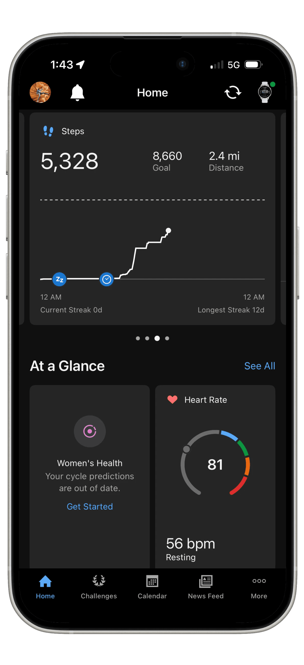
Garmin
Competitor 1
Competitor 1
Oura

Competitor 2
Competitor 2
Strength
Strength
Great storytelling / insights
Great storytelling / insights
Vs
Vs
Weakness
Weakness
Limited user flexibility
Limited user flexibility
Strength
Strength
Quick digestible stats
Quick digestible stats
Vs
Vs
Weakness
Weakness
Performance Focused
Performance Focused
Discovered Pain Points
Role
UX | UI Design, Research, Prototyping
Category
App Re-design
Year
2025
Tool Credits
Figma, After Effects
Info
While Apple Health is a staple in the wellness space, users often encounter hurdles in data clarity and navigation. This redesign explores the core of what makes a health app effective, identifying gaps through competitive analysis, user research, and friction mapping. By pivoting toward a "clarity-first" model, the new experience delivers digestible content, visualized data, and actionable insights through a more seamless, intuitive interface.
The Current iOS Apple Health
1
Home page is a centralized Hub
Summary, Pinned, Trends, Highlights
2
All Health Data
Today, Past 7 Days, Past 12 Months, Older
3
In text description with recommendation articles
Competitive Analysis
Strength
Quick digestible stats
Vs
Weakness
Performance Focused
Garmin
Competitor 1

Strength
Great storytelling / insights
Vs
Weakness
Limited user flexibility
Oura
Competitor 2
Discovered Pain Points
Discovered Pain Points

So ... how can we fix this issue?
So ... how can we fix this issue?
So ... how can we fix this issue?
Lets Explore
Lets Explore
01
01
Home Page Interaction
Home Page Interaction
Pop ups, Badges
Pop ups, Badges
Gamified Experience
Gamified Experience
Celebrating Progress
Celebrating Progress
Rewarding System


01
Home Page Interaction

Pop ups, Badges
Gamified Experience

Celebrating progress
Rewarding System
02
02
Humanized Engagement
Humanized Engagement
02
Humanized Engagement
Motivation
Supportive Structure


Daily Insights
Streamlined Overview

Motivation
Motivation
Supportive structure
Supportive structure


Daily Insights
Daily Insights
Streamlined overview
Streamlined overview

03
Clarity&Storytelling
03
Clarity&Storytelling
Correlation
Correlation
Shows how activities improve health
Shows how activities improve health
Activity Summary
Activity Summary
Provides a daily scope of performances
Provides a daily scope of performances


Clarity & Storytelling
03

Correlation
Shows how activities improve your health

Activity Summary
Provides a daily scope of activities & performance